Man Behind Pokémon's Iconic Logo Revealed
- By Jason
- May 21,2025
When you receive an unexpected call from the president of Nintendo of America, you don’t question it—you simply answer. This was the advice given to designer Chris Maple by a fellow designer friend in 1998, just before the call came. At the time, Maple was accustomed to such sudden communications, running his design business, Media Design, which thrived on last-minute projects for companies in urgent need. Although his firm rarely received public recognition, it built a solid reputation among clients in the Seattle area, including Boeing, the Seattle Mariners, and Holland America Line cruises.
Maple’s experience took a surprising turn when he received a call from Minoru Arakawa’s secretary, inviting him to Nintendo of America’s Redmond office. He was informed that the company wanted him to work on a new game, but details were scarce. Intrigued, Maple accepted the invitation, unaware that he was about to play a pivotal role in the global cultural phenomenon known as Pokémon.
Go West, Pocket Monsters
Upon arriving at Nintendo’s headquarters, Maple spent about half an hour in the lobby, captivated by a striking 21-inch crystal horse head. He recalls the sensation of entering a corporate environment, where he often had to read the room and understand the underlying issues clients faced. Eventually, he was escorted to a meeting room where he met Arakawa and a few others.
Arakawa introduced himself and explained that Nintendo was planning to launch a game in the United States and Europe. Previous agencies had failed to meet their expectations, exhausting both budget and time. Arakawa asked if Maple was willing to take on the challenge, to which Maple confidently agreed.
A woman then entered with a cardboard box filled with toys, papers, and drawings, which she dumped on the table in front of Maple. Puzzled, Maple asked what it was, and Arakawa replied, “It’s a Pocket Monster. We’re going to call it Pokémon.”
Maple was tasked with creating a new logo for Pokémon, which at that time was known in Japan as Pocket Monsters Red and Green. Nintendo aimed to release the game in the West as Pokémon Red and Blue, followed by a Yellow Pikachu Edition. The challenge was to rebrand from “Pocket Monsters” to “Pokémon” within a tight one-month deadline, with no specific instructions on the desired design.
The Mystery of the Missing Crystal Horse Head
In recent days, I’ve been on a digital scavenger hunt to find the crystal horse head Maple described. This piece of decor made a significant impression on him, possibly influencing his design subconsciously. Despite my efforts, no trace of the horse head exists online, and it’s absent from any videos of Nintendo’s old lobby from that period. Nintendo moved to a new building in 2010, and the old office is now a tennis court. Former employees and regular visitors don’t recall the horse head, suggesting Maple might have entered a different lobby. Nintendo did not respond to my inquiries, and The Pokémon Company, which didn’t exist in its current form in 1998, was also unhelpful. Other industry contacts and institutions like DigiPen and The Video Game History Foundation provided no leads.
Update 7:21 a.m. PT: Shortly after this article was published, I received a tip about the book "Game Over" by David Sheff, which mentions the crystal horse head on page 198. I’ve contacted Sheff for further details or photos.
If you have any information or photos of this mysterious crystal horse head, please reach out to me at [email protected]. I’m eager to learn more.
Attaching Energy
Typically, designing a logo like this would take about six months, involving extensive back-and-forth with the client. However, Nintendo’s one-month deadline was non-negotiable, as the new logo needed to be ready for the E3 1998 unveiling of Pokémon Red and Blue.
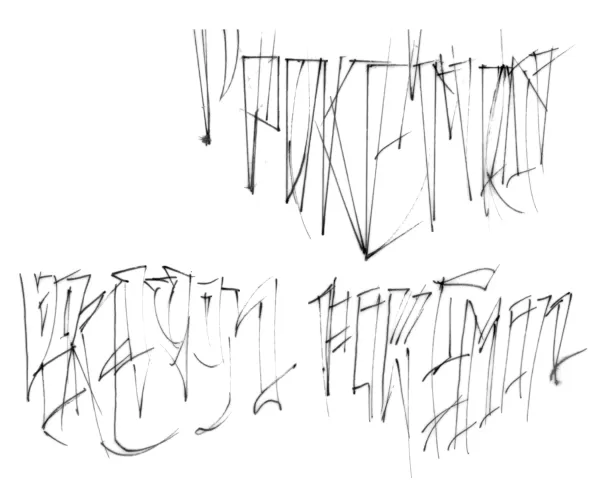
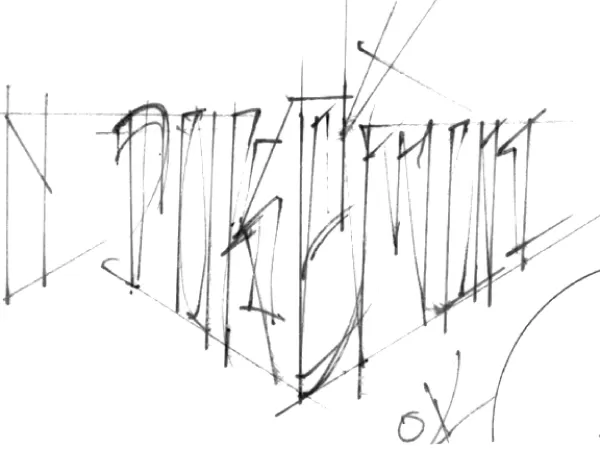
Maple, accustomed to tight deadlines, began sketching various Pokémon logos by hand on a light table. He created multiple variations, setting aside those he liked to try something different, ultimately presenting several options to Nintendo.
Original Pokemon Logo Sketches by Chris Maple
 View 8 Images
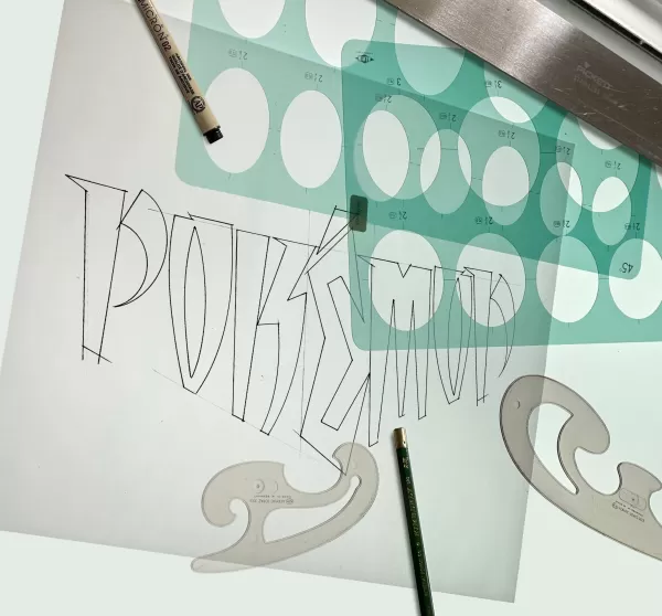
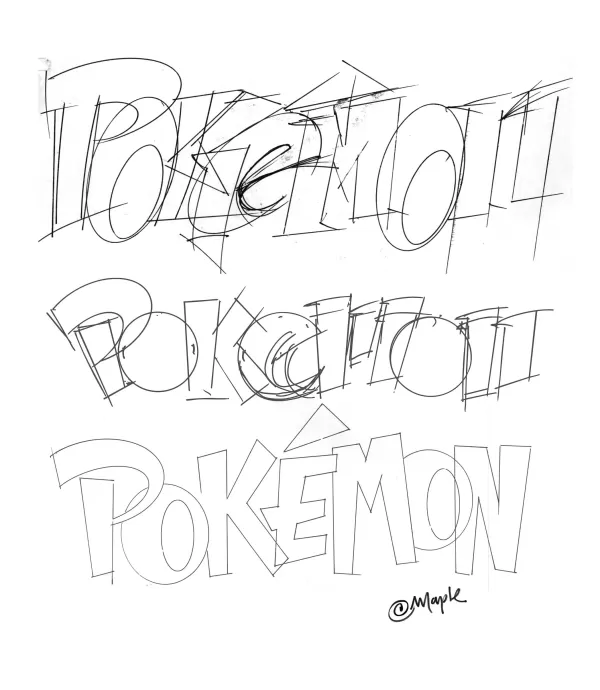
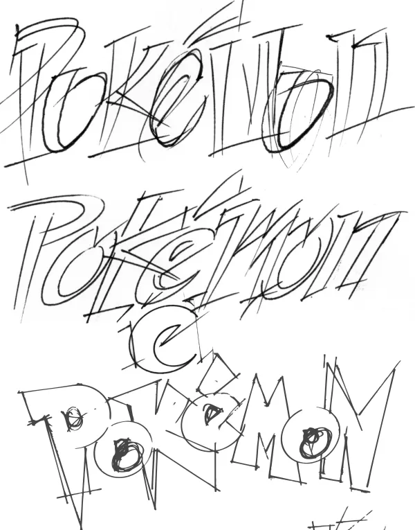
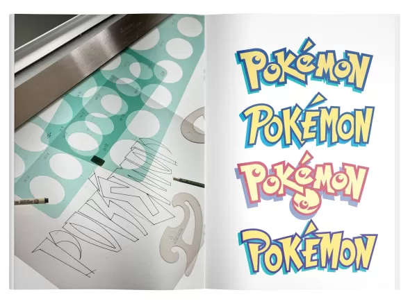 Despite having limited information—mainly paper and toys, including a tiny Pikachu figurine—Maple was briefed on the game and saw some monster illustrations and an early version of a Nintendo Power magazine featuring the game. The logo needed to be suitable for the GameBoy’s small, pixelated screen and work in both color and black and white.
After presenting his designs, Maple started with versions he was less enthusiastic about, receiving little reaction. When he unveiled his favorite, the room fell silent. Then, Don James, former executive VP of operations at Nintendo of America, declared, “I believe this is the one,” and instructed Maple to produce it.
Maple attributes his preference for the final logo to its energy and the story he envisioned behind it. The choice of yellow and blue for the logo might have been influenced by the upcoming Western releases, Pokémon Blue and Yellow, though Maple admits it was more about the feeling it conveyed.
 Color tests for the Pokémon logo, provided by Chris Maple.Once the logo was finalized, Maple stepped back as Nintendo prepared for the game’s marketing and release. A few months later, while shopping with his son at Toys R Us, he was struck by the massive Pokémon display featuring his logo.
Pokémon Forever
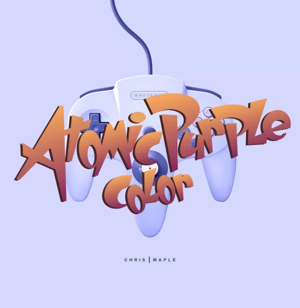
Maple’s involvement with Nintendo didn’t end there. After E3, Arakawa requested minor adjustments to the logo, which Maple made to the interior of the “P” and “E,” resulting in the logo we recognize today. He later worked on other projects, including designs for Major League Baseball Featuring Ken Griffey Jr., Mischief Makers, and a Star Wars game, possibly Star Wars: Rogue Squadron, as well as the Nintendo 64’s Atomic Purple release.

 Despite playing Pokémon games only briefly, Maple’s son collected the trading cards until they were banned at school. His daughter proudly shared that her father designed the logo, earning him recognition from other parents.
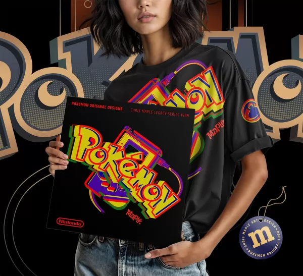
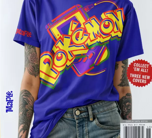
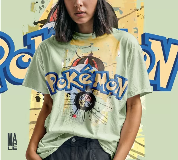
As Nintendo began hiring more in-house designers, Maple’s work with the company tapered off. For years, he kept his role in the Pokémon logo’s creation private, as it was common in his industry not to credit individual logo designers. Recently, encouraged by his son, Maple has started to share his story publicly, displaying the logo on his website alongside new T-shirt designs.
When asked what he would do differently now, Maple suggests reverting to the original 1998 logo and expresses a desire to be involved in any 30th-anniversary celebration, emphasizing the importance of maintaining the logo’s foundational energy and integrity.
Maple feels a sense of responsibility for the countless children and adults who have connected with Pokémon, noting the joy it brings him to see their reactions when he shares his role in its creation. His continued work in teaching children in challenged areas further underscores his commitment to making a positive impact.
Chris Maple Modern Mock-up Logo Images
 View 4 Images